In the previous episode of As the Calories Churn, we looked at why it doesn’t really make sense to compare the carbohydrate intake of Americans in 1909 to the carbohydrate intake of Americans in 1997. [The folks who read my blog, who always seem to be a lot smarter than me, have pointed out that, besides not being able to determine differing levels of waste and major environmental impacts such as a pre- or early-industrial labor force and transportation, there would also be significant differences in: distribution and availability; what was acquired from hunted/home-grown foods; what came through the markets and ended up as animal rather than human feed; what other ingredients these carbohydrates would be packaged and processed with; and many other issues. So in other words, we not comparing apples and oranges; we are comparing apples and Apple Jacks (TM).]
America in 1909 was very different from America in 1997, but America in 1970 was not so much, certainly with regard to some of the issues above that readers have raised. By 1970, we had begun to settle into post-industrial America, with TVs in most homes and cars in most driveways. We had a wide variety of highly-processed foods that were distributed through a massive transportation infrastructure throughout the country.
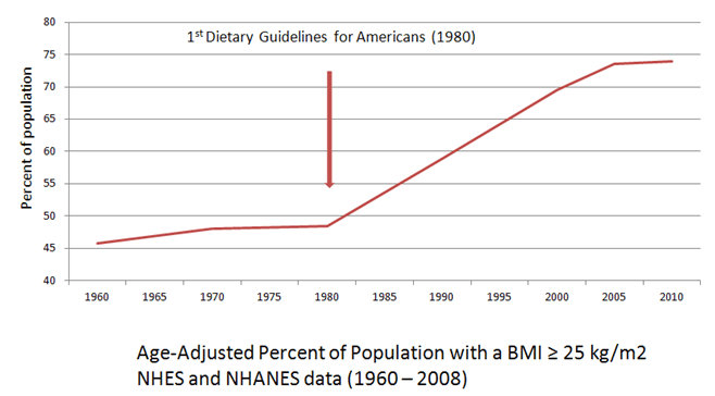
Beginning in the mid-1960s, availability of calories in the food supply, specifically from carbohydrates and fats had begun to creep up. So did obesity. It makes sense that this would be cause for concern from public health professionals and policymakers, who saw a looming health crisis ahead if measures weren’t taken–although others contended that our food supply was safer and more nutritious than it had ever been and that public health efforts should be focused on reducing smoking and environmental pollutants.
What emerged from the political and scientific tug-of-war that ensued (a story for another blog post) were the 1977 Dietary Goals for Americans. These goals told us to eat more grains, cereals and vegetable oils and less fat, especially saturated fat.
Then, around 1977 – 1980, in other words around the time of the creation of the USDA’s recommendations to increase our intake of grains and cereals (both carbohydrate foods) and to decrease our intake of fatty foods, we saw the slope of availability of carbohydrate calories increase dramatically, while the slope of fat calories flattened–at least until the end of the 1990s (another story for another blog post).

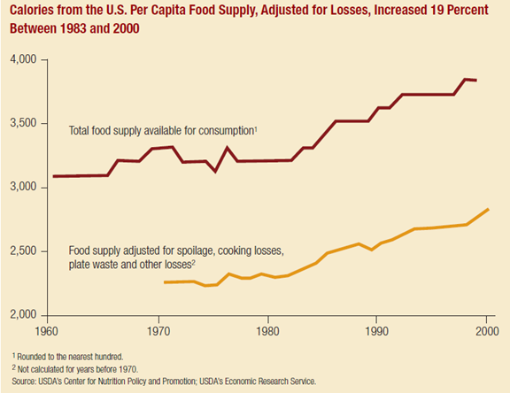
[From food availability data, not adjusted for losses.]
The question is: How did the changes in our food supply relate to the national dietary recommendations we were given in 1977? Let’s take a closer look at the data that we have to work with on this question.
Dear astute and intelligent readers: From this point on, I am primarily using loss-adjusted food availability data rather than food availability data. Why? Because it is there, and it is a better estimate of actual consumption than unadjusted food availability data. It only goes back to around 1970, so you can’t use it for century-spanning comparisons, but if you are trying to do that, you’ve probably got another agenda besides improving estimation anyway. [If the following information makes you want to go back and make fun of my use of unadjusted food availability data in the previous post, go right ahead. In case you didn’t catch it, I think it is problematic to the point of absurdity to compare food availability data from the early 1900s to our current food system—too many changes and too many unknowns (see above). On the other hand, while there are some differences, I think there are enough similarities in lifestyle and environment (apart from food) between 1970 and 2010 to make a better case for changes in diet and health being related to things apart from those influences.]
Here are the differences in types of food availability data:
Food availability data: Food availability data measure the use of basic commodities, such as wheat, beef, and shell eggs for food products at the farm level or an early stage of processing. They do not measure food use of highly processed foods– –in their finished form. Highly processed foods–such as bakery products, frozen dinners, and soups—are not measured directly, but the data includes their less processed ingredients, such as sugar, flour, fresh vegetables, and fresh meat.
Loss-Adjusted Food Availability: Because food availability data do not account for all spoilage and waste that accumulates in the marketing system and is discarded in the home, the data typically overstate actual consumption. Food availability is adjusted for food loss, including spoilage, inedible components (such as bones in meat and pits in fruit), plate waste, and use as pet food.
The USDA—and some bloggers too, I think—prefer unadjusted food availability data. I guess they have decided that if American food manufacturers make it, then Americans MUST be eating it, loss-adjustments be damned. Our gluttony must somehow overcome our laziness, at least temporarily, as we dig the rejects and discards out of the landfills and pet dishes—how else could we get so darn fat?
I do understand the reluctance to use dietary intake data collected by NHANES, as all dietary intake data can be unreliable and problematic (and not just the kind collected from fat people). But I guess maybe if you’ve decided that Americans are being “highly inaccurate” about what they eat, then you figure it is okay be “highly inaccurate” right back at Americans about what you’ve decided to tell them about what they eat. Because using food availability data and calling it “consumption” is to put it mildly, highly inaccurate, by a current difference of over 1000 calories.
On the other hand, it does sound waaaaaay more dramatic to say that Americans consumed 152 POUNDS (if only I could capitalize numbers!) per person of added sweeteners in 2000 (as it does here), than it does to say that we consumed 88 pounds per person that year (which is the loss-adjusted amount). Especially if you are intent on blaming the obesity crisis on sugar.
Which is kinda hard to do looking at the chart below.
Loss adjusted food availability:
| Calories per day | 1970 | 2010 | |
| Total | 2076 | 2534 | +458 |
| Added fats and oils | 338 | 562 | +224 |
| Flour and cereal products | 429 | 596 | +167 |
| Poultry | 75 | 158 | +83 |
| Added sugars and sweeteners | 333 | 367 | +34 |
| Fruit | 65 | 82 | +17 |
| Fish | 12 | 14 | +2 |
| Butter | 29 | 26 | -3 |
| Veggies | 131 | 126 | -5 |
| Eggs | 43 | 34 | -9 |
| Dairy | 245 | 232 | -13 |
| Red meat* | 349 | 267 | -82 |
| Plain whole milk | 112 | 24 | -88 |
*Red meat: beef, veal, pork, lamb
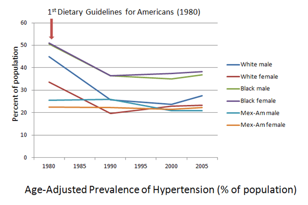
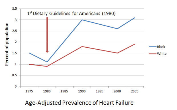
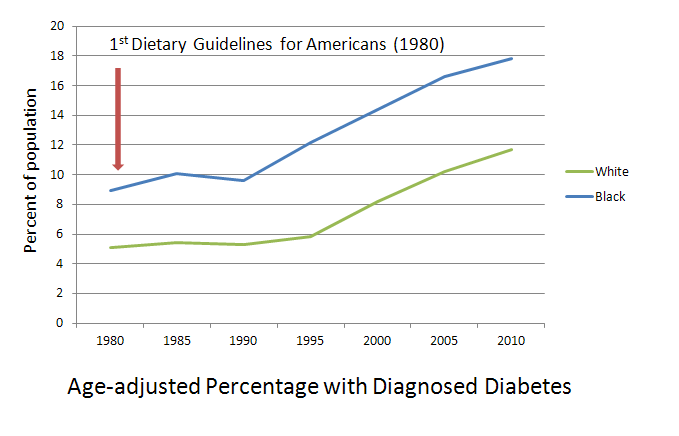
Anybody who thinks we did not change our diet dramatically between 1970 and the present either can’t read a dataset or is living in a special room with very soft bouncy walls. Why we changed our diet is still a matter of debate. Now, it is my working theory that the changes that you see above were precipitated, at least in part, by the advice given in the 1977 Dietary Goals for Americans, which was later institutionalized, despite all kinds of science and arguments to the contrary, as the first Dietary Guidelines for Americans in 1980.
Let’s see if my theory makes sense in light of the loss-adjusted food availability data above (and which I will loosely refer to as “consumption”). The 1977 [2nd Edition] Dietary Goals for Americans say this:
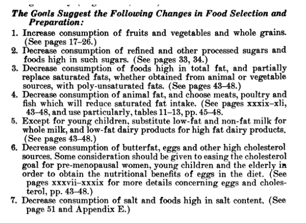
#1 – Did we increase our consumption of grains? Yes. Whole? Maybe not so much, but our consumption of fiber went from 19 g per day in 1970 to 25 g per day in 2006 which is not much less than the 29 grams of fiber per day that we were consuming back in 1909 (this is from food availability data, not adjusted for loss, because it’s the only data that goes back to 1909).
The fruits and veggies question is a little more complicated. Availability data (adjusted for losses) suggests that veggie consumption went up about 12 pounds per person per year (sounds good, but that’s a little more than a whopping half an ounce a day), but that calories from veggies went down. Howzat? Apparently Americans were choosing less caloric veggies, and since reducing calories was part of the basic idea for insisting that we eat more of them, hooray on us. Our fruit intake went up by about an ounce a day; calories from fruit reflects that. So, while we didn’t increase our vegetable and fruit intake much, we did increase it. And just FYI, that minuscule improvement in veggie consumption didn’t come from potatoes. Combining fresh and frozen potato availability (adjusted for losses), our potato consumption declined ever so slightly.
#2 – Did we decrease our consumption of refined sweeteners? No. But we did not increase our consumption as much as some folks would like you to think. Teaspoons of added (caloric) sweeteners per person in our food supply (adjusted for waste) went from 21 in 1970 to 23 in 2010. It is very possible that some people were consuming more sweeteners than other people since those numbers are population averages, but the math doesn’t work out so well if we are trying to blame added sweeteners for 2/3 of the population gaining weight. It doesn’t matter how much you squint at the data to make it go all fuzzy, the numbers pretty much say that the amount of sweeteners in our food supply has not dramatically increased.
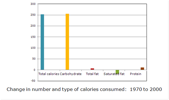
#3 – Did we decrease our consumption of total fat? Maybe, maybe not—depends on who you want to believe. According to dietary intake data (from our national food monitoring data, NHANES), in aggregate, we increased calories overall, specifically from carbohydrate food, and decreased calories from fat and protein. That’s not what our food supply data indicate above, but there you go.

Change in amount and type of calories consumed from 1971 to 2008
according to dietary intake data
There is general agreement , however, from both food availability data and from intake data, that we decreased our consumption of the saturated fats that naturally occur with red meat, eggs, butter, and full-fat milk (see below), and we increased our consumption of “added fats and oils,” a category that consists almost exclusively of vegetable oils, which are predominantly polyunsaturated and which were added to foods–hence the category title–such as those inexpensive staples, grains and cereals, during processing.
#4 – Did we decrease our consumption of animal fat, and choose “meat, poultry, and fish which will reduce saturated fat intake”? Why yes, yes we did. Calories from red meat—the bearer of the dreaded saturated fat and all the curses that accompany it—declined in our food system, while poultry calories went up.
(So, I have just one itty-bitty request: Can we stop blaming the rise in obesity rates on burgers? Chicken nuggets, yes. KFC, yes. The buns the burgers come on, maybe. The fries, quite possibly. But not the burgers, because burgers are “red meat” and there was less red meat—specifically less beef—in our food supply to eat.)
Michael Pollan–ever the investigative journalist–insists that after 1977, “Meat consumption actually climbed” and that “We just heaped a bunch more carbs onto our plates, obscuring perhaps, but not replacing, the expanding chunk of animal protein squatting in the center.” In the face of such a concrete and well-proven assumption, why bother even looking at food supply data, which indicate that our protein from meat, poultry, fish, and eggs “climbed” by just half an ounce?
In fact, there’s a fairly convenient balance between the calories from red meat that left the supply chain and the calories of chicken that replaced them. It seems we tried to get our animal protein from the sources that the Dietary Goals said were “healthier” for us.
#5 – Did we reduce our consumption of full-fat milk? Yes. And for those folks who contend this means we just started eating more cheese, well, it seems that’s pretty much what we did. However, overall decreases in milk consumption meant that overall calories from dairy fat went down.
#6 – Did we reduce our consumption of foods high in cholesterol? Yes, we did that too. Egg consumption had been declining since the relative affluence of post-war America made meat more affordable and as cholesterol fears began percolating through the scientific and medical community, but it continued to decline after the 1977 Goals.
#7 – Salt? No, we really haven’t changed our salt consumption much and perhaps that’s a good thing. But the connections between salt, calorie intake, and obesity are speculative at best and I’m not going to get into them here (although I do kinda get into them over here).
 What I see when I look at the data is a good faith effort on the part of the American people to try to consume more of the foods they were told were “healthy,” such as grains and cereals, lean meat, and vegetable oils. We also tried to avoid the foods that we were told contained saturated fat—red meat, eggs, butter, full-fat milk—as these foods had been designated as particularly “unhealthy.” No, we didn’t reduce our sweetener consumption, but grains and cereals have added nearly 5 times more calories than sweeteners have to our food supply/intake.
Although the America of 1970 is more like the America of today than the America of 1909, some things have changed. Probably the most dramatic change between the America of the 1970s and the America of today is our food-health system. Women in the workplace, more suburban sprawl, changing demographics, increases in TV and other screen time—those were all changes that had been in the works for a long time before the 1977 Dietary Goals came along. But the idea that meat and eggs were “bad” for you? That was revolutionary.
And the rapid rises in obesity and chronic diseases that accompanied these changes? Those were pretty revolutionary as well.
One of my favorite things to luck upon on a Saturday morning in the 70s—aside from the Bugs Bunny-does-Wagner cartoon, “What’s Opera, Doc?“—were the public service announcements featuring Timer, an amorphous yellow blob with some sing-along information about nutrition:

From your head down to your feet
Thinks like meat and eggs and fish you
Meat and eggs weren’t bad for you. They didn’t cause heart disease. You needed them to build up muscle tissue and to keep you from being hungry!
But in 1984, when this showed up on the cover of Time magazine (no relation to Timer the amorphous blob), I—along with a lot of other Americans—was forced to reconsider what I’d learned on those Saturday morning not that long ago:

My all-time favorite Timer PSA was this one:
When my get up and go has got up and went,
I hanker for a hunk of cheese.
Or any time I’m weak in the knees . . .
In the 80s, when I took up my low-fat, vegetarian ways, I would still hanker for a hunk of cheese, but now I would look for low-fat, skim, or fat-free versions—or feel guilty about indulging in the full-fat versions that I still loved.
I’m no apologist for the food industry; such a dramatic change in our notions about “healthy food” clearly required some help from them, and they appear to have provided it in abundance. And I’m not a fan of sugar-sweetened beverages or added sweeteners in general, but dumping the blame for our current health crisis primarily on caloric sweeteners is not only not supported by the data at hand, it frames the conversation in a way that works to the advantage of the food industry and gives our public health officials a “get out of jail free card” for providing 35 years worth of lousy dietary guidance.
Next time on As the Calorie Churns, we’ll explore some of the interaction between consumers, industry, and public health nutrition recommendations. Stay tuned for the next episode, when you’ll get to hear Adele say: “Pollanomics: An approach to food economics that is sort of like the Field of Dreams—only with taco-flavored Doritos.”